We encounter data visualizations every day in a wide variety of forms, from simple bar charts to complex network diagrams. This raises the question: How widespread are data visualizations today?
To get a solid insight, I investigated which industrial fields rely on such visualizations. Data from crunchbase served as the starting point. From the results we can draw conclusions about the industries in which visualizations are already established today and where future fields may be found.
Data
In order to gain a comprehensive insight into different industries, the data from crunchbase was used. The commercial database collects and curates company information with a focus on technology, investments and startups. Thanks to the kind permission of crunchbase, I was able to use the data (as of July 2020) as part of my research (University of Salzburg).
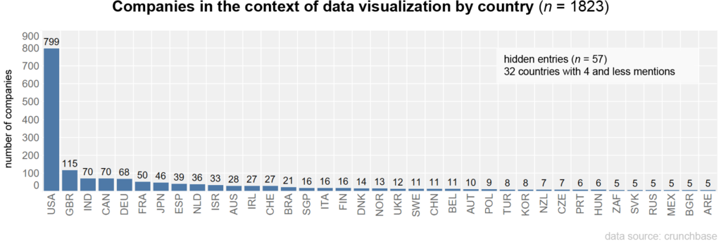
The data set reflects global structures. The coverage of industries and countries varies (1). The data used covers more than 1.08 million companies in 213 different countries and administrative regions. In terms of overall distribution, the USA appears overrepresented. Among the entries with a country assignment, 40.9% are assigned to the USA, followed by the UK (8.3%), India (5.3%), Germany (4.2%) and others.
Method
To determine which industries and branches of industry rely on data visualization, the industry fields of companies, which occur together with data visualization are analyzed. From this, a so-called “co-occurrence matrix” can be calculated, which shows the common frequencies of the industries for the entire data set. Subsequently, this matrix can be visualized as a network graph.
Procedure
In the first step, all companies that have since been closed and investor groups were filtered out. For the analysis, the remaining 1.03 million companies are now filtered according to whether they have at least the industry field “data visualization”. This leaves 1823 companies. All the unique industry sectors are then extracted from these companies and sorted according to their frequency.

The distribution shows an extreme long-tail curve. Since the filter criterion was the field “data visualization”, this occurs accordingly most frequently, followed by Software and Analytics.
The 1823 companies with data visualization are then used to calculate the co-occurrence matrix, which shows how often industries are mentioned together. The frequencies are similarly extremely distributed here as well.
Results
Before discussing the industry fields in which data visualizations are most commonly used, we first present the country distribution, founding years and financing of the companies.
Distribution by country
The majority of the companies are located in the USA, with 48.7%. Data were missing for 126 companies.
Founding year
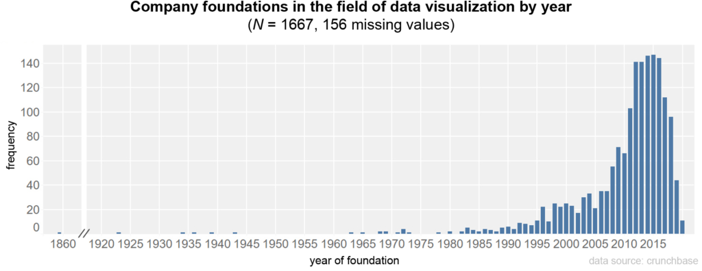
With regard to the date of foundation of the companies, there is a clear increase in 2008 and a leveling off from 2018 onwards; the median is in 2013 (missing data from 156 companies).
Financial resources
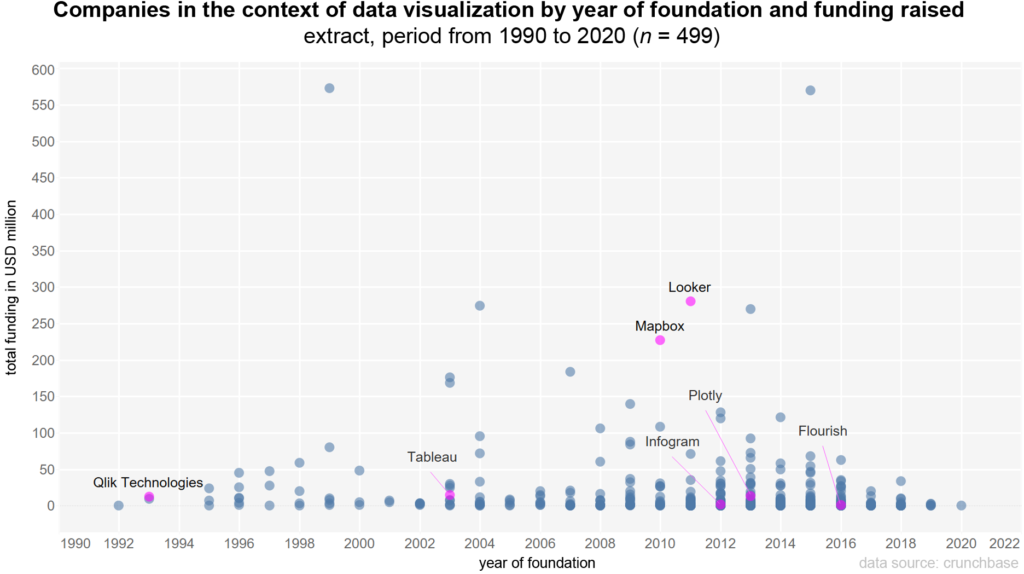
In addition to the company foundations, the funds raised also provide an indication of the relevance of these companies. Information on the financing received and the year of foundation is available for 506 firms. Over the entire period (1923–2020), the median investment is $1.9 million per firm (average $14.9 million). The chart shows the period 1990–2020, with well-known companies that offer data visualization as software (as a program or web-based) highlighted in color. These include: Qlik Technologies, Tableau, Mapbox, Looker, Infogram, Plotly and Flourish.
Industry sectors
After discussing the context of the companies, it is now possible to visualize the commonly mentioned industries as a network graph, based on the co-occurence matrix. The network shows 462 different industries, visualized by the points (nodes). The connecting lines (edges) between the points represent the frequency of the common mention of industry fields.
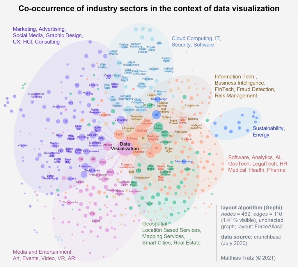
For a better overview, only the most relevant nodes (above the 75th percentile) were labeled and only the most frequent edges (above the 90th percentile) were shown. The size of the nodes results from the number of connecting lines. The closer two nodes are to each other, the more often they were named together. The color grouping of the nodes is based on a clustering using the modularity algorithm. Based on the network structure, groups are formed that have a high probability of belonging together (2).
The nodes clearly decrease in size from the center outwards. Smaller nodes mean that these fields were named significantly less. For example, while the “Cloud Computing — IT” cluster (top, center) has a very large number of mentions, the fields in the “Media — Entertainment” cluster seem less established. These fields could provide clues to future industry fields.
On the graph the main fields of each of the seven clusters have been added. The network shows a variety of application areas of data visualizations, which can be roughly sorted into three societal fields:
- Public: news, journalism, publishing, GovTech, law enforcement, public safety
- Industry: software, analytics, medical, geospatial, business intelligence, FinTech health, InsurTech, HR
- Science: higher education, e-learning, STEM education, neuroscience
Since most of these are young companies or startups, the impact of data visualization in these fields is yet to be seen. The industry clusters related to technical data processing in the area of cloud computing, data management, database, IT, software, analytics, big data or AI are visible very clearly. Data visualizations have long served as tools of communication in standardized processes, e.g. CRISP-DM (3). Other areas such as marketing, advertising, design, video, VR or AR also include companies that offer visualizations as a means of communication, such as design agencies.
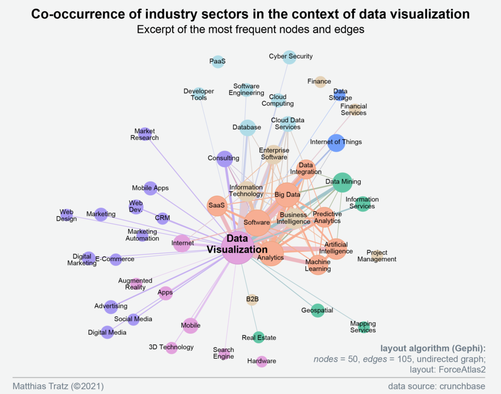
Industry sector data visualization in detail
To focus on the most mentioned fields, the network was reduced further. What remained were 50 of the original 462 industry sectors. The graph clearly shows that data visualizations are particularly represented in technical areas: Analytics, Software, Big Data, SaaS, Business Intelligence, Data Integration, Machine Learning and Artificial Intelligence.
Industry field artificial intelligence in detail
For comparability of the data, the same analysis was performed for the field of artificial intelligence (14 379 companies, unique values [industry sectors] = 649). The firms have a median founding year in 2016. Raised funding over the entire time period covered (1801- 2020) is a median of $2 million (mean = 19.0 m). When plotting, only nodes with the most frequent connections were shown. The groups were clustered using the modularity algorithm, but the color assignments are not identical to the graph on data visualization.
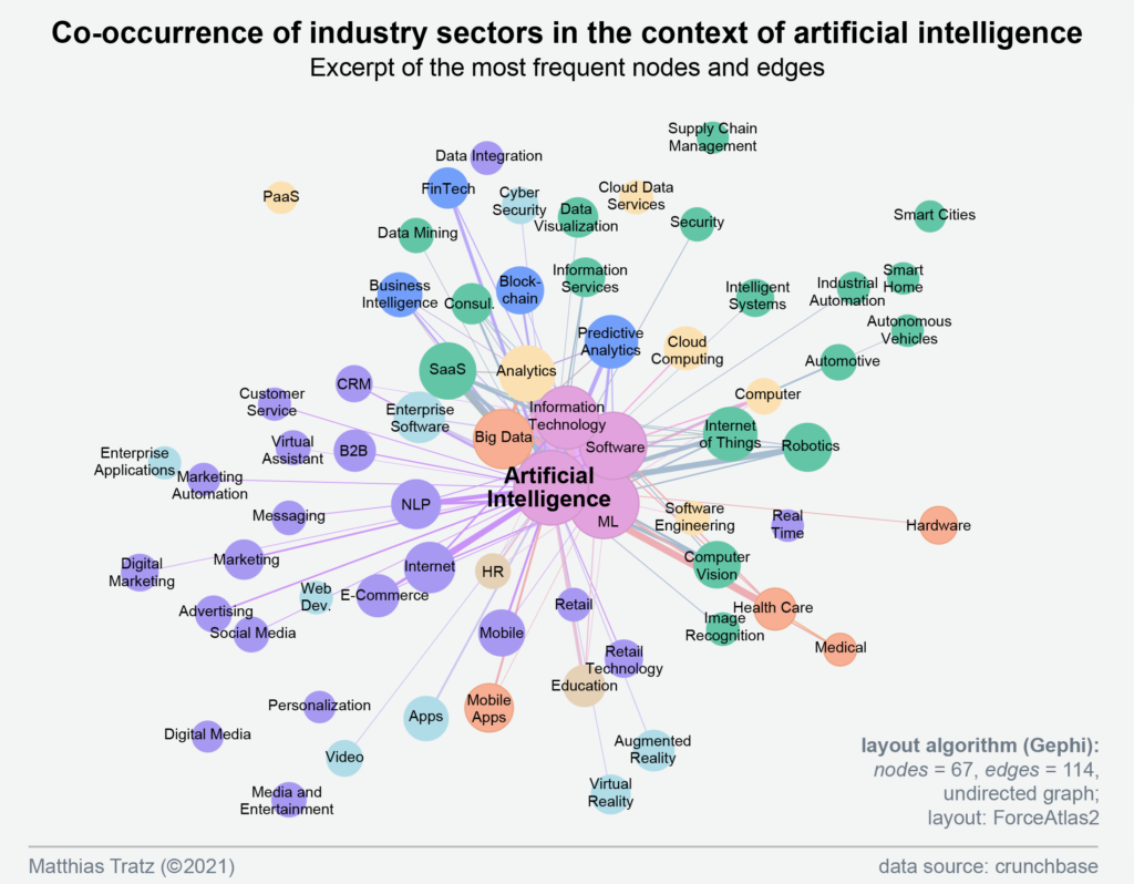
In the field of artificial intelligence, references to technical fields such as machine learning, software, big data, analytics, and AI analysis methods such as NLP, computer vision, and image recognition become clear. There are also strong connections to application areas such as SaaS (Software as a Service), Business Intelligence, Fintech, Health Care, and Medical. Data visualization (center, top) is also found as a node, but with lower co-occurrences, evident from the thinner connecting line.
Conclusion
Using the data from crunchbase, it was possible to a gain deep insight into the industries in which data visualizations are already being used today. The network graph illustrates commonly emerging areas of activity. In addition to established and anticipated application areas such as software, analytics, FinTech, and business intelligence, a number of industries emerge where data visualization may be increasingly used in the future. These include: GovTech, LegalTech, Medical, Health, EdTech, Media, as well as News.
The amount of funding raised by these companies can be understood as an indication of the existing interest and a correspondingly high assessment of the potential of the technologies and business ideas. The companies in the Data visualization area receive a median of $1.9 million, which is relatively similar to the companies in AI with about $2 million. However, the outliers for AI range up to $7.4 billion, whereas the maximum for Data visualization is $573 million.
The increasing number of company foundations within the last decade could be an indication of a convergence of data processing and data visualization. Among the companies in the field of data visualization, the median of the founding years is in 2013 and in the field of AI in 2016. In addition to advances in data processing, there have also been developments towards the formalization and empiric validation of data visualizations.
What can we expect in the future?
The results suggest that data visualizations are increasingly used as a new visual approach. Increasing use may also lead to pressure to adapt, resulting in standardization of data visualizations, up to and including new conventions (4). By extension, visualizations can form a new access to information. In this form, they can help shape prevailing symbol systems in a society (5). In European history, we saw the social effects through the standardization of writing by means of letterpress printing, which led to new feedback dynamics in the exchange of opinions and knowledge (6, 7).
A greater use of data visualizations in everyday life and at work can have an impact on communication processes. The insight into the company fields showed that such techniques can increasingly be found in various fields of societies.
What’s next
If you have come this far, thanks for reading!
For more follow my updates.
In the coming weeks, there will be more articles on the topics of data visualization, artificial intelligence and design. These will cover current trends and developments as well as best practice of how to choose data visualizations.
Matthias Tratz is working at the intersections of design and data science. His work has been featured and awarded with various prices, including the Austrian State Price. Currently he is researching about predicting design patterns.
────
The article is based on my research about artificial intelligence as an enabler for data visualization automation (2021).
Footnotes
- Rössler, 2017, S. 90–91
- Börner et al., 2019
- Brosius et al., 2016, S. 45–46
- Döring & Bortz, 2016, S. 278
- Krotz, 2017, S. 355
- Giesecke, 2006, S. 131, 133
References
- Börner, K., Bueckle, A. & Ginda, M. (2019). Data visualization literacy: Definitions, conceptual frameworks, exercises, and assessments. Proceedings of the National Academy of Sciences of the United States of America, 116(6), 1857–1864. https://doi.org/10.1073/pnas.1807180116
- Brosius, H.-B., Haas, A. & Koschel, F. (2016). Methoden der empirischen Kommunikationsforschung: Eine Einführung (7. Aufl.). Studienbücher zur Kommunikations- und Medienwissenschaft. Springer VS.
- Döring, N. & Bortz, J. (2016). Forschungsmethoden und Evaluation in den Sozial- und Humanwissenschaften (5. Aufl.). Springer.
- Giesecke, M. (2006). Der Buchdruck in der frühen Neuzeit: Eine historische Fallstudie über die Durchsetzung neuer Informations- und Kommunikationstechnologien (4. Aufl.). Suhrkamp.
- Krotz, F. (2017). Pfade der Mediatisierung: Bedingungsgeflechte für die Transformationen von Medien, Alltag, Kultur und Gesellschaft. In F. Krotz, C. Despotović & M.-M. Kruse (Hrsg.), Medien – Kultur – Kommunikation. Mediatisierung als Metaprozess: Transformationen, Formen der Entwicklung und die Generierung von Neuem (S. 347–364). Springer VS.
- Rössler, P. (2017). Inhaltsanalyse (3. Aufl.). UTB.