Data visualizations make it easier for us to communicate information and find decisions. But how widespread are data visualizations and what are the differences between industries?
To answer this question, I examined websites of unicorn startups and Fortune 500 companies. The analysis shows that there are very clear differences between industries, between communication strategies and apparently also between cultural groups (comparing Asian and Western countries).
Data set
Two global groups of companies were selected to study the industries. One is Unicorn Startups (471 companies, CB Insights 2019) and the other is Global Fortune (500 companies, Fortune Magazine 2019), the companies with the highest revenues worldwide. In each case, the datasets include the company name, industry sector, and country of origin.
Method
The study uses quantitative visual content analysis. A random sample is taken from each of the two data sets. The companies are then examined with a coding sheet to determine whether they use data visualizations on their websites or in their products and services. An index value is calculated from the various characteristics recorded.
Features recorded
The five visualization types Chart, Graph, Map, Tree and Network (1, 2) serve as collection criteria. The codes recorded are representative of the entire website. Frequencies of features are not captured. For example, if a company uses graphs multiple times, distributed across different subpages, this feature is coded as present only once.
Visual representations that can be traced back to conventions or design trends are not recorded, e.g. display of company addresses or multiple company locations on maps (Google Maps, icons, etc.).
Visual Index
Three variables are used to calculate the “visual index”. It is recorded whether data visualizations occur on the website or are presented as part of the product or service. Another three-level variable captures whether visualizations relate to concrete values or are merely conceptual. The use of visualizations in products or services is scored twice. The three variables are combined into the “visual index” and normalized. This results in five possible gradations between 0 and 1 (A, 3, 4).
Results: Significant differences per company sector
The results are discussed individually for the two groups of companies Unicorn Startups and Global Fortune 500. With regard to websites, minus websites that could not be retrieved, 259 (5 missing) were analyzed for the Startups and 257 (16 missing) for the Global Fortune.
Unicorn Startups
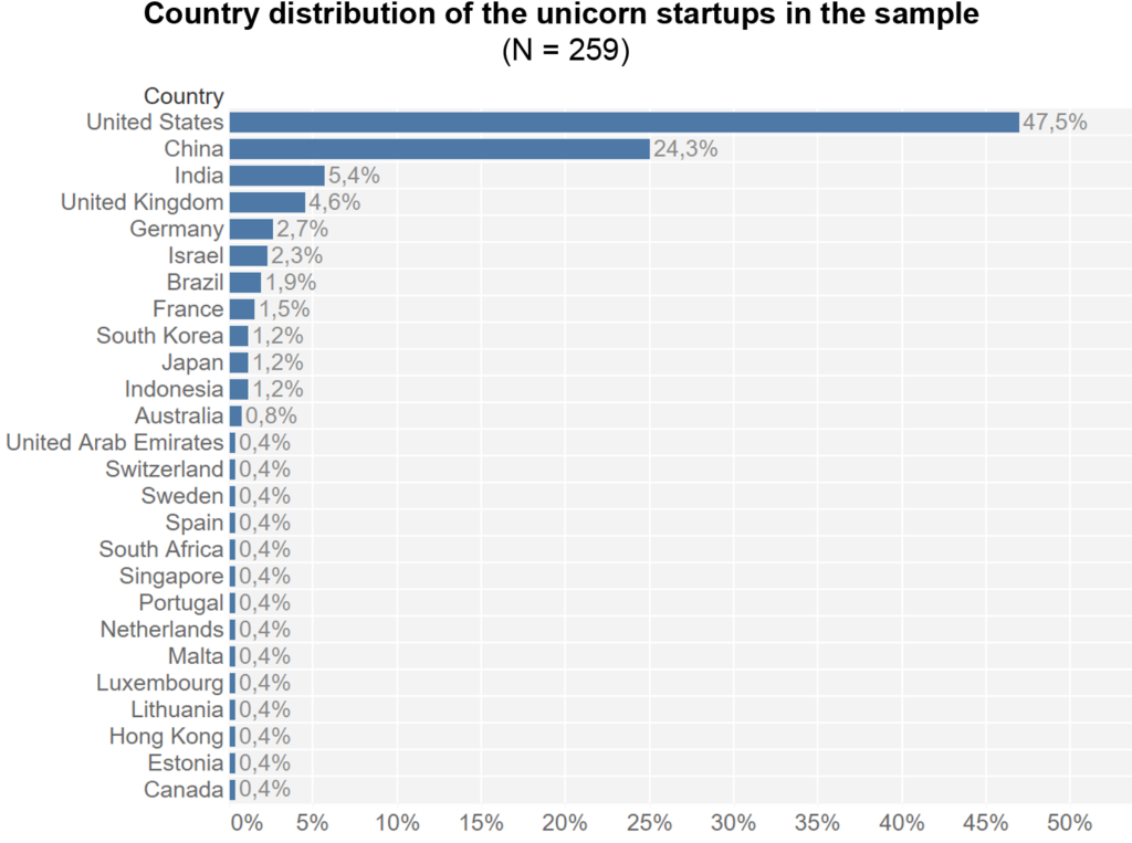
The distribution of country affiliations shows that the USA and China account for the majority of companies.
Visual index by industry
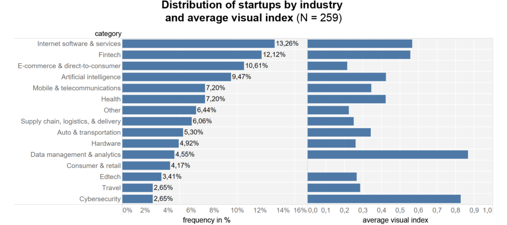
In terms of startup industry groups, Internet software & services, Fintech, E-commerce & direct-to-consumer, and Artificial Intelligence are the most common.
The diagram shows the frequencies of the industries in the sample. This is followed by the respective mean value of the visual index, which is derived from the use of data visualizations on the company websites. This shows that data visualizations are used significantly more frequently in technical areas such as “Data management & analytics” and “Cybersecurity”.
Grouping to industry fields
For the statistical analysis, the individual industries were grouped according to similarities and reference fields:
- AI & Data: Artificial intelligence, Data management & analytics, Fintech, Health
- Internet & Communication: Internet software & services, Mobile & telecommunications, Cybersecurity
- Industry & Manufacturing: Auto & transportation, Hardware, Supply chain – logistics, & delivery
- Other: Consumer & retail, E-commerce & direct-to-consumer, Other, Travel, Edtech
The boxplot of the grouped company sectors shows clear differences. While the median of the visual index is 0.5 in the two groups AI & Data and Internet & Communication, it drops to 0 in the other two groups.
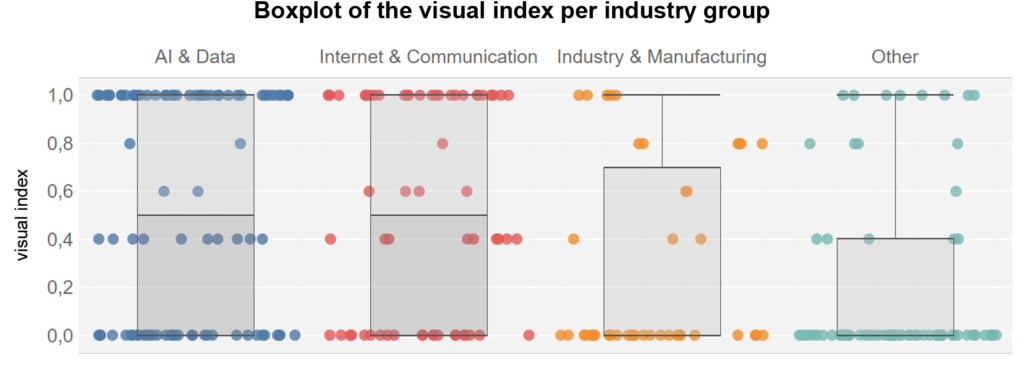
These differences are also statistically significant, indicating that there is a moderately strong relationship between the use of data visualizations and the respective company industry (Chi-Square (12, N = 259) = 51.9, p = .000; Fisher-Exact Test p = .000; Cramer’s V = 0.256).
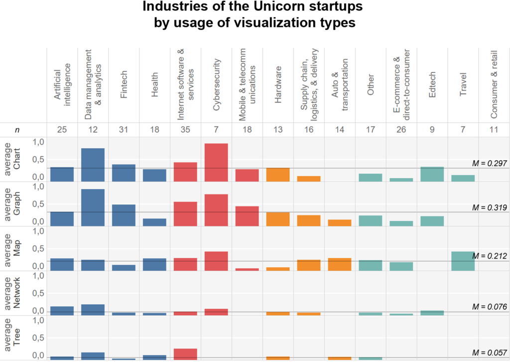
Visualizations used depending on the industry
If we compare the industries according to the types of visualization they use, it becomes clear that Data Management & Analytics, Fintech, Internet Services and Cybersecurity use charts and graphs more frequently than other industries. The mean values shown can be interpreted as relative frequencies. For example, 75% of the companies from the “Data Management & Analytics” sector used the visualization form charts, which is significantly higher than the average of 29.7% for all companies.
For maps, travel and cybersecurity are above average. Data Management & Analytics and Artificial Intelligence increasingly use network visualizations. Internet Software & Services use tree diagrams most frequently of all industries.
Use in different cultural areas
Finally, the use of visualizations by country is presented for the Unicorn startup dataset. China accounts for the majority of firms in the Asian region (24.3%) and the U.S. in the Western region (47.5%). Countries are assigned to global regions based on ILOSTAT classification: Asia and the Pacific (n = 96), Europe and Northern America (n = 156), Rest (n = 7).
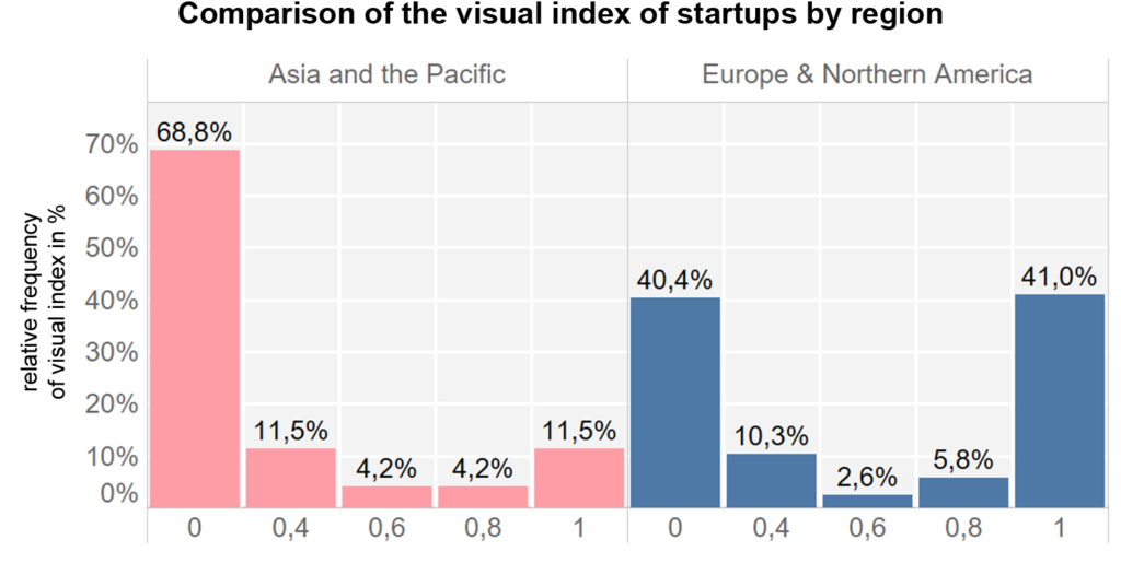
A comparison of the country groups shows that companies in Western regions achieve the highest visual index value of 1 significantly more often (41%), whereas only 11.5% in the Asia and Pacific group make use of it. Differences in non-use also emerge clearly. The results are also statistically significant. The visual index and thus the use of data visualizations are related to the cultural group of the respective company sector (Chi-square (4, N = 252) = 27.65, p = .000, Fisher’s exact test: p = .000; Cramer’s V = 0.231).
Global Fortune 500
The second dataset of Global Fortune 500 companies was not studied in detail because of a systematic bias. These companies used data visualizations mainly to display their stock prices. Accordingly, charts and graphs account for the majority of visualizations. Apart from that, especially the industries Energy, Financial, Technology as well as Transportation use data visualizations. Overall, however, the use of data visualizations is very low.
Conclusion
There is a clear correlation between the use of data visualizations and the industry. Especially companies in the technical environment, such as data science, IT, analytics or AI, use visualizations more frequently, as do companies that have easily processable data, such as in the finance, healthcare or software sectors.
Depending on the industries and target groups, companies’ communication strategies also vary. For example, Global Fortune 500 companies hardly use data visualizations on their websites, except to show their stock prices.
Differences also emerged in the comparison of countries. Companies from Asia and the Pacific region used significantly fewer data visualizations. Reasons for this could be so-called mediatization processes. These processes take place differently depending on society and culture and build on earlier transformations through media developments in each case (5). The writing culture can also be an influencing factor. For example, typographic information policy in Asian countries proceeded differently than in Europe. Due to the diversity and complexity of pictographic characters, standardization in letterpress printing was more difficult (6).
What can we expect?
The use of data visualizations always depends on established conventions. While financial data can easily be represented as bar charts or line graphs – best-practice solutions are still missing for other industries. The easier and cheaper it is to analyze data automatically, the more possibilities open up for visual representations. For companies targeting Western-oriented markets, it can make sense to process and communicate content using data visualizations wherever possible.
Matthias Tratz is working at the intersections of design and data science. His work has been featured and awarded with various prices, including the Austrian State Prize. Currently he is researching about predicting design patterns.
────
The article is based on my research about artificial intelligence as an enabler for data visualization automation (2021).
Footnotes
- Rössler, 2017, S. 90–91
- Börner et al., 2019
- Brosius et al., 2016, S. 45–46
- Döring & Bortz, 2016, S. 278
- Krotz, 2017, S. 355
- Giesecke, 2006, S. 131, 133
References
- Börner, K., Bueckle, A. & Ginda, M. (2019). Data visualization literacy: Definitions, conceptual frameworks, exercises, and assessments. Proceedings of the National Academy of Sciences of the United States of America, 116(6), 1857–1864. https://doi.org/10.1073/pnas.1807180116
- Brosius, H.-B., Haas, A. & Koschel, F. (2016). Methoden der empirischen Kommunikationsforschung: Eine Einführung (7. Aufl.). Studienbücher zur Kommunikations- und Medienwissenschaft. Springer VS.
- Döring, N. & Bortz, J. (2016). Forschungsmethoden und Evaluation in den Sozial- und Humanwissenschaften (5. Aufl.). Springer.
- Giesecke, M. (2006). Der Buchdruck in der frühen Neuzeit: Eine historische Fallstudie über die Durchsetzung neuer Informations- und Kommunikationstechnologien (4. Aufl.). Suhrkamp.
- Krotz, F. (2017). Pfade der Mediatisierung: Bedingungsgeflechte für die Transformationen von Medien, Alltag, Kultur und Gesellschaft. In F. Krotz, C. Despotović & M.-M. Kruse (Hrsg.), Medien – Kultur – Kommunikation. Mediatisierung als Metaprozess: Transformationen, Formen der Entwicklung und die Generierung von Neuem (S. 347–364). Springer VS.
- Rössler, P. (2017). Inhaltsanalyse (3. Aufl.). UTB.

