Data visualization through the centuries – a visual analysis of milestones
Excerpt from research article
Excerpt from research article
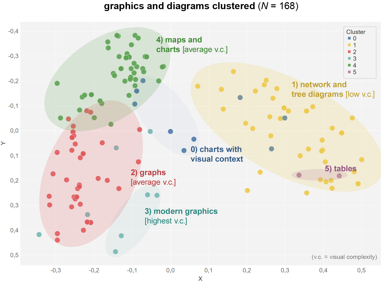
Cluster analysis of visual milestones
The analysis of 168 charts and diagrams uncovers several groups, which share certain characteristics.
• Cluster 0: Charts with visual context: pictograms and icons
• Cluster 1: Network and tree graphs with low visual complexity
• Cluster 2: Graphs with medium visual complexity
• Cluster 3: Modern graphs with highest visual complexity
• Cluster 4: Maps and charts with medium visual complexity
• Cluster 5: Tables with ordering function
Results
Data visualizations have not been widely adopted due to challenges such as high reproduction costs, limited color choices, duplication limitations, and distrust caused by ambiguity. To gain acceptance, visual and social conventions needed to develop, which required a change in culture, society, and everyday life.
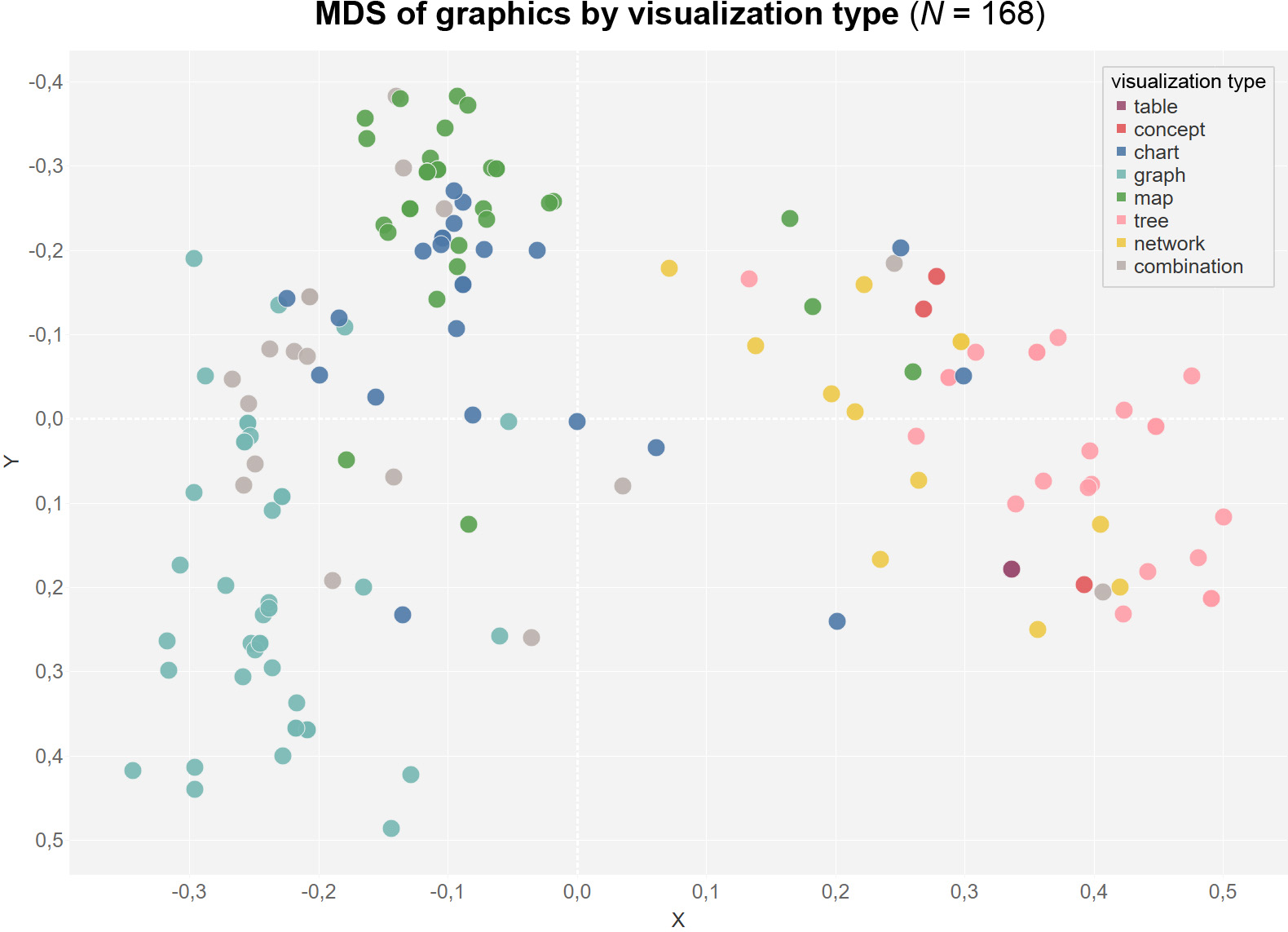
The cluster analysis based on the type of data visualization.
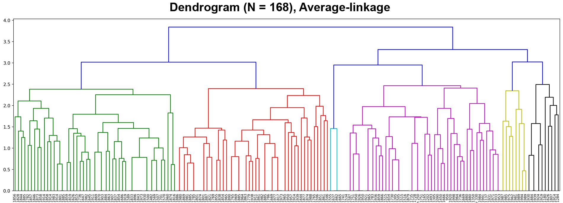
The dendrogram of the analysis showing the similarity of the different charts and diagrams.