design and technology study programs
Rebranding and new positioning of study programs.
Rebranding and new positioning of study programs.
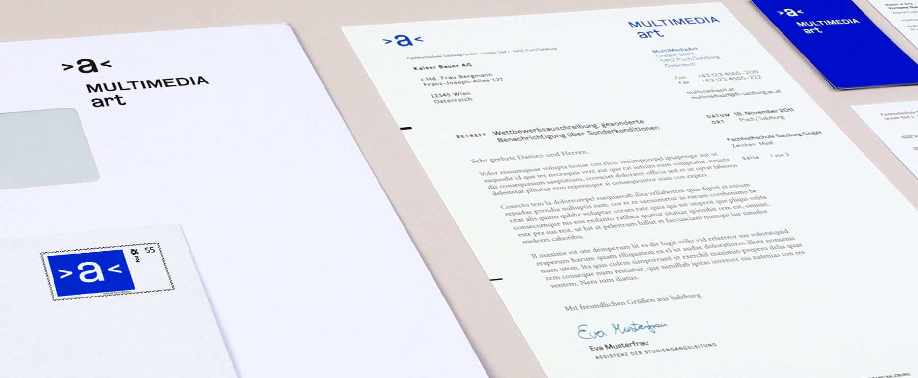
Two study programs which work closely together had to similar visual identities. An additional umbrella brand contributed further to a variety of different communication channels.
Simplify the communication of the design and technology study programs. Avoid misunderstandings because of similarity. Make cooperations between the departments visually comprehensible.
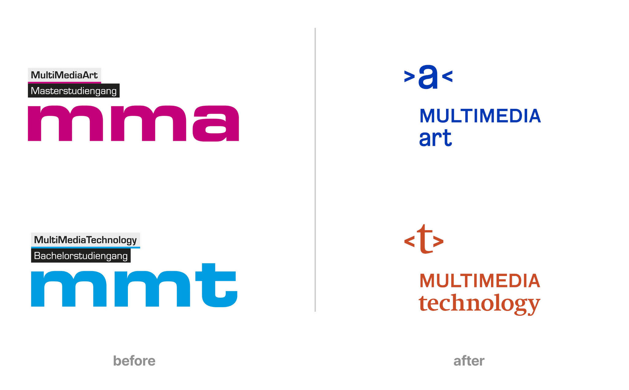
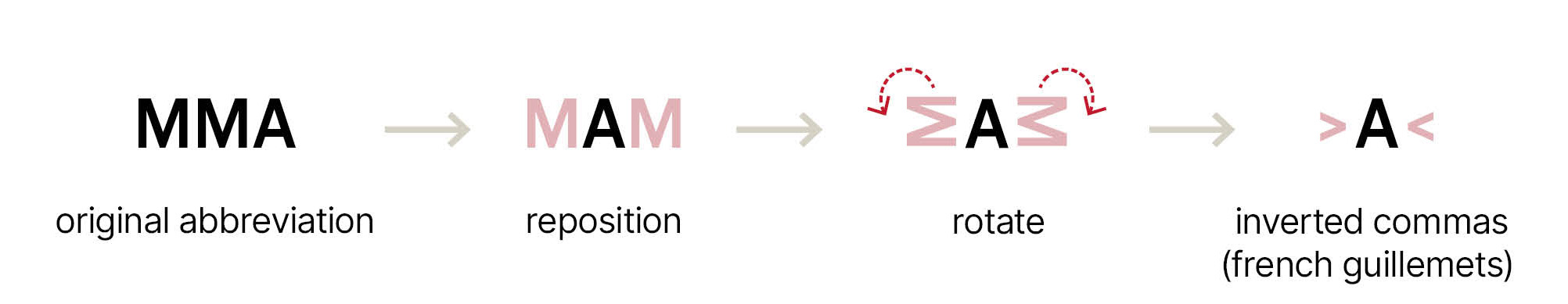
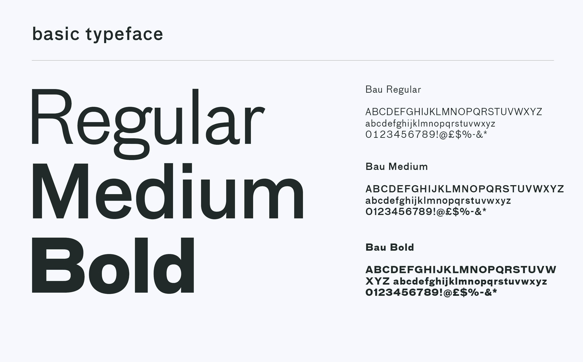
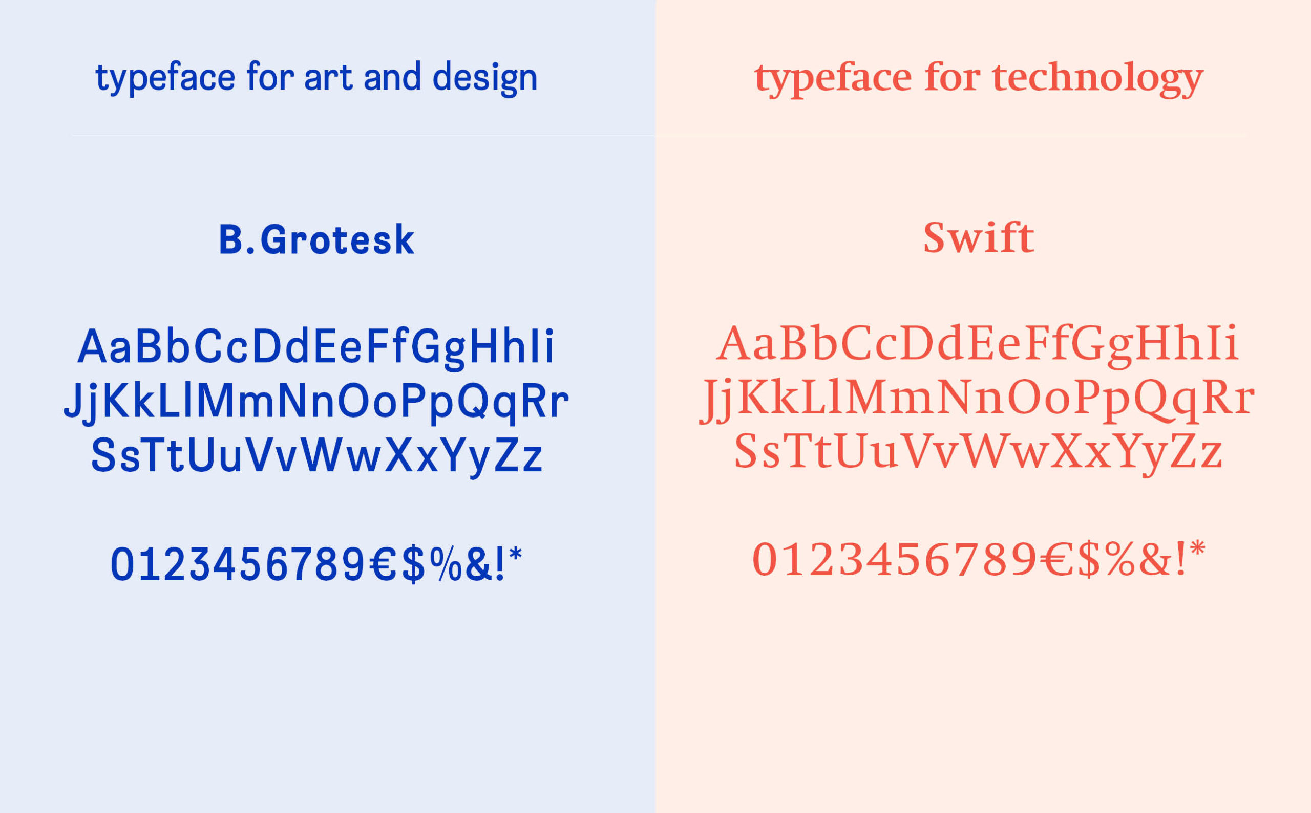
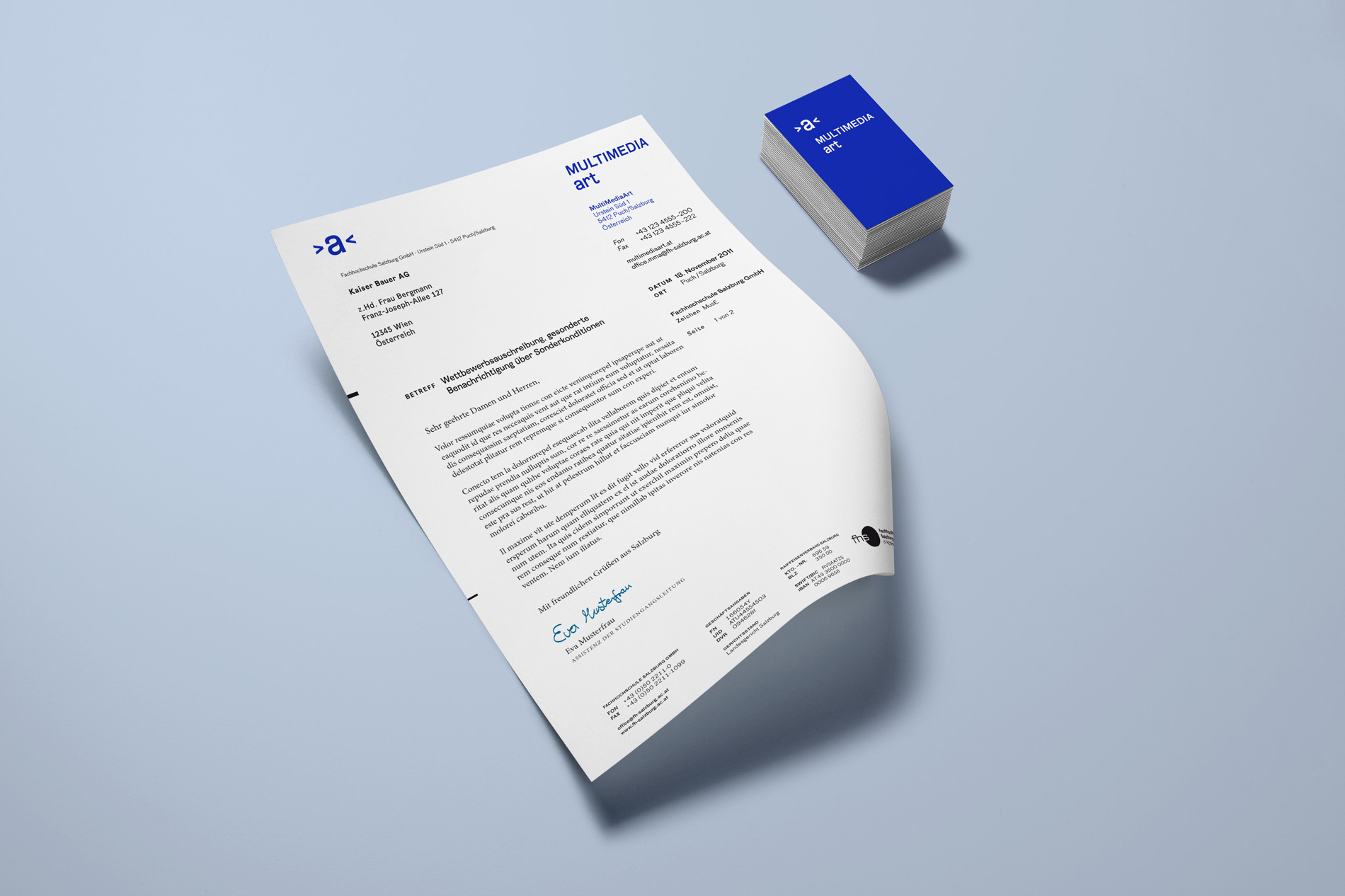
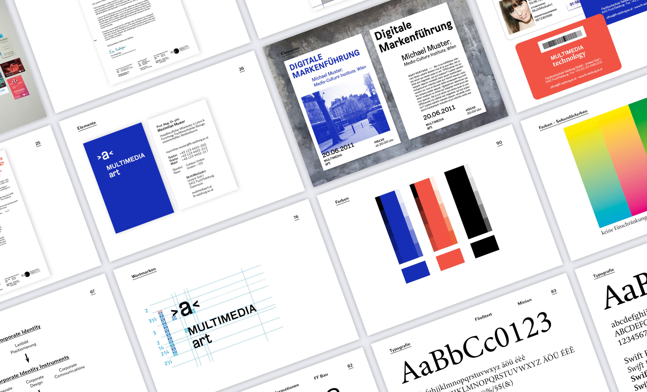
The new visual identity should only serve as a frame. The main focus should be set on the work and projects of the students. For the technology program an intense orange-red was chosen to avoid the technical stereotype. The design program received an intense royal blue. In addition, each study has distinct short logos and an particular grid system, which enables to emphasize their own tonality on otherwise similar documents.
Mission Statement
Core of the redesign is to inform the public about the work of the students, the events and opportunities offered. The visual design provides the necessary infrastructure. The two cooperating studies should express their own character via typography and operate without stereotypical clichés. Both studies are equal and positioned independently.
visual design position

Brand Identity
Strategy
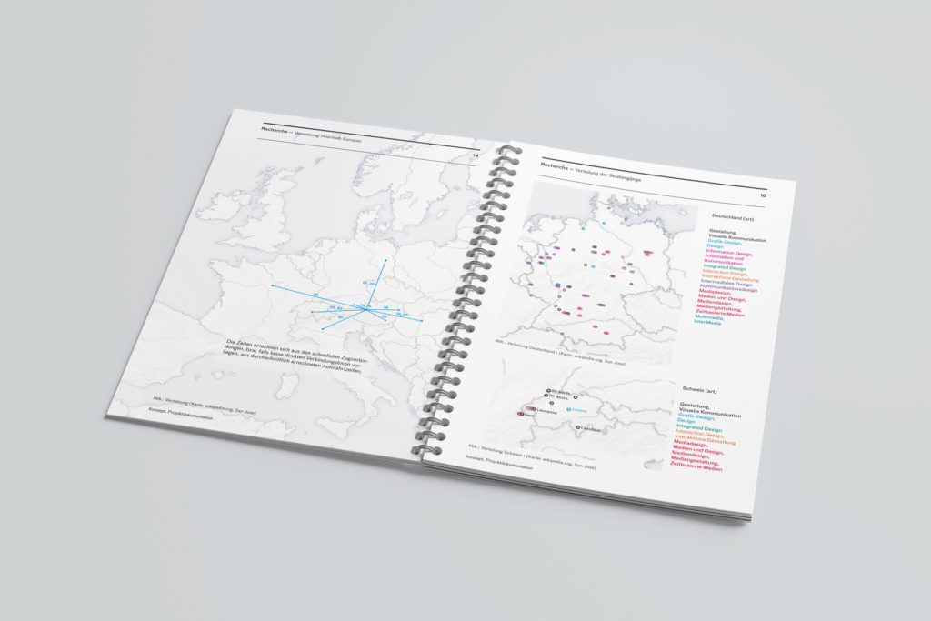
Research
Higher Education