Currently, I am working on a new personal website. Depending on your field of work, your website is a place to present your skills, experience and values.
Of course, you try to fit your website to your target audience. However, what do you do if you don’t fit into one typical skillset? Especially when you work in the intersections of two fields, you have to decide how you present yourself to be understood.
One important factor concerning the design of your website is familiarity. On the one hand, you have to match the typical visual patterns of your industry so much, that your customers recognize you as a potential fit. On the other hand, you want to be as unique as possible.
Each domain has its own content and visual markers. Graphic designers, for example, present themselves for larger agencies or compete for awards with technical or visually impressive portfolio websites. If you are a writer, you will show your media coverage as social proof, have a blog section and offer a newsletter. But what might be best-practice if you are positioned between two fields like are an artist and programmer, or a researcher and designer?
My assumptions
I was curious about this question, because I am working within design and data science, with a focus on developing products based on data insights. Therefore, using a typical graphic design pattern would not address this expertise well. I assumed there might be a strong difference between data related fields and graphic design.
Gathering data
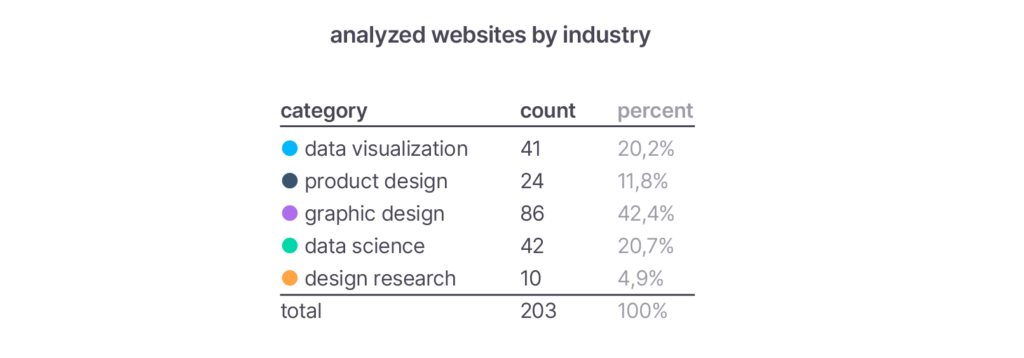
To back up my assumptions I did some data mining of websites (N=203) from various domains: graphic design, product design, data visualization, design research, and data science. I sampled them based on list with featured designers and data scientists or looked up leading designers from larger companies on twitter. Among them are: Kati Forner, Studio RoAndCo, Made Thought, TwoPoints, Martin Oberhaeuser, Katherine M. Zhou, Giorgia Lupi, Christian Laesser, Marian Dörk, Katharine Jarmul, Jim Vallandingham, Andreas C. Müller.
I set up a simple coding book to estimate the rough visual style, with three to five stepped scales:
- Typography
- Font Sizes
- Layout Structure
- Text to image ratio
- Text Length
- Visual Hierarchy.
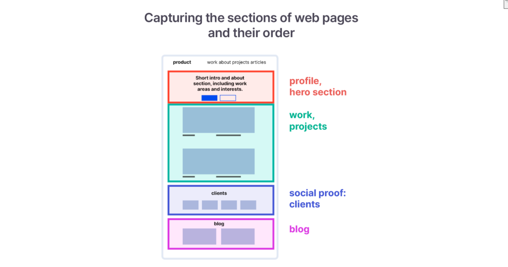
Additionally, I looked at which sections (work, about, profile, social proof, etc.) are shown on a website’s landing page and in which order they are presented.
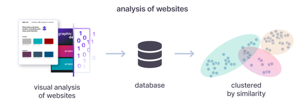
Methods to analyze websites
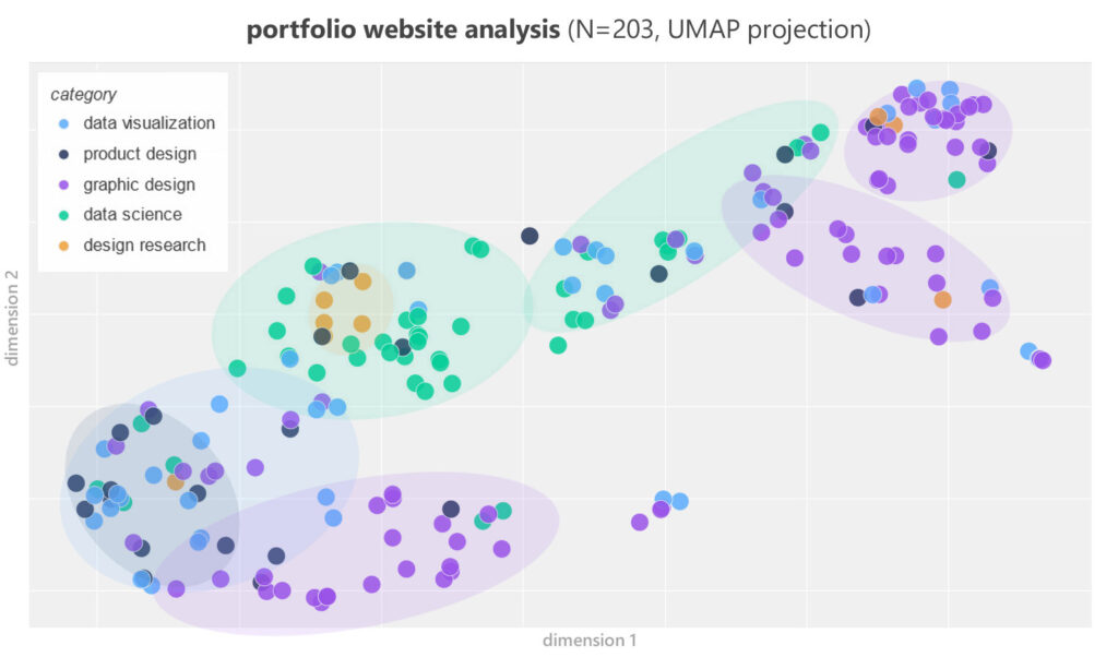
To quickly go through all the websites, I used an annotation tool, which is often used for machine learning. I analyzed the data with python, and visualized them as a scatter plot (UMAP projection).
Results: What patterns did we uncover?
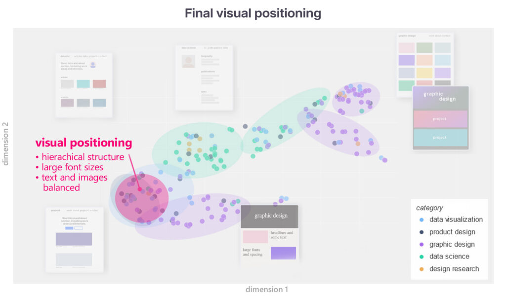
After clustering all of the variables regarding the visual style we find three different groups, which can be further subdivided. For example, data science forms two groups and graphic design three. The scatterplot shows groups which are similar within. The groups nearby share some of their characteristics.
Differences in visual appearances
To better illustrate the characteristics of the clusters, I made some stereotype mockups showing the styles of these websites. Additionally, typical features were annotated. The boundaries between the clusters are fluid. Data Visualization practitioners are found in the data science as well as in some graphic design patterns. The same applies to the product designers.
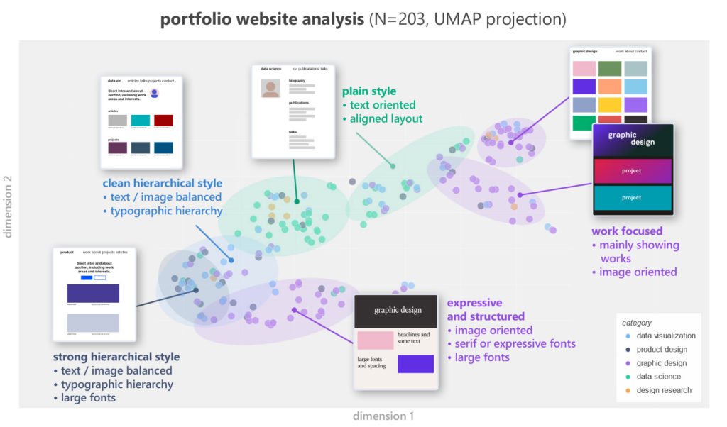
Presenting work and expertise
When it comes to presenting expertise and working examples, we can spot strong differences. Many graphic designers just show their works and nothing else. Whereas data science practitioners often clarify their services or expertise with their resume or in the about sections. We also find websites, where the know-how is reassured by social proof, as with clients, awards or testimonials.
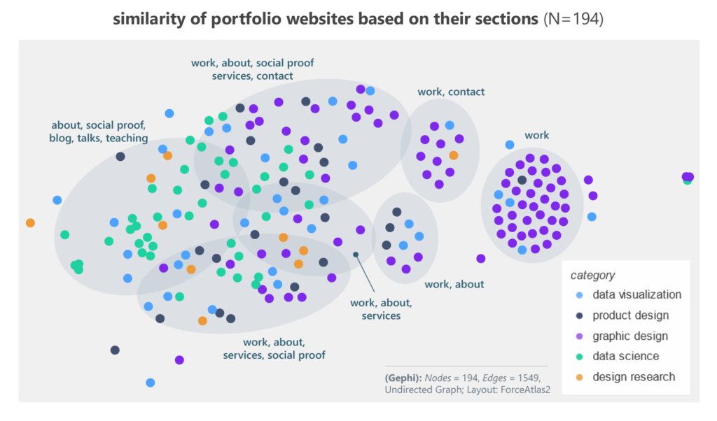
We can clearly see these differences in the similarities of websites, based only on the sections and their ordering on the landing pages.
Industry typical patterns
It’s important to keep in mind, that different domains vary in their visual appearances and content structure because of varying quality markers. As an example, for some data scientists it might be more relevant to showcase their written code on platforms like GitHub, instead of presenting and describing the projects on their websites.
Positioning of my site
Based on the findings, I have chosen a visual style that falls between Graphic Design and Data Science, in the area of Product Design. In terms of content, this classification also fits, since I present research results in addition to projects and also discuss them in blog posts.
Conclusion: Match your industry pattern
and find your unique touch
Before you start thinking about your visual pattern, it is crucial that you have a clear mission statement: What service do you offer, who are your clients, what problems do you solve and especially, why do you do it? Communicate in simple words what you are standing for.
Your positioning serves you as starting point to choose the right visual patterns for your domain. If you are indecisive, ask yourself, in which domain you would position yourself to the greater part, then start the research process:
- find different domains you want to compare
- sample a variety of websites from industry leaders or featured persons
- annotate the websites (visual style and/or content)
- cluster the data and identify typical patterns
You should aim for as much familiarity, that you can be recognized by your audience. Use this constraint as a creative barrier. Try to differ as much as you like within this frame and you will be recognizable and strike out. For my design process this was helpful to rethink my first visual concept. Based on the analysis I selected the pattern of product design and data visualization – between data science and graphic design.
Using a data-driven approach may help you go from your gut feeling (your “tacit knowledge”) to a clearer overview of design patterns and underlying constraints. Try to break your impressions down into specific data points, and explore them. You may find something unexpected.
published in Dec. 2022 • updated 13.08.2025

