How much do industries differ in their
use of data visualizations?
Excerpt from research article
Excerpt from research article
Result
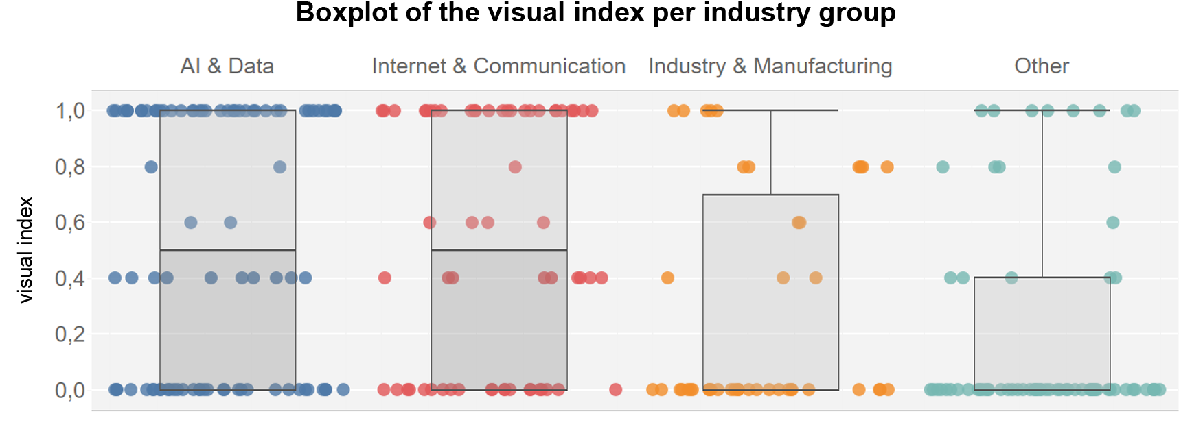
There is a clear correlation between the use of data visualizations and the industry. Especially companies in the technical environment, such as data science, IT, analytics or AI, use visualizations more frequently, as do companies that have easily processable data, such as in the finance, healthcare or software sectors.
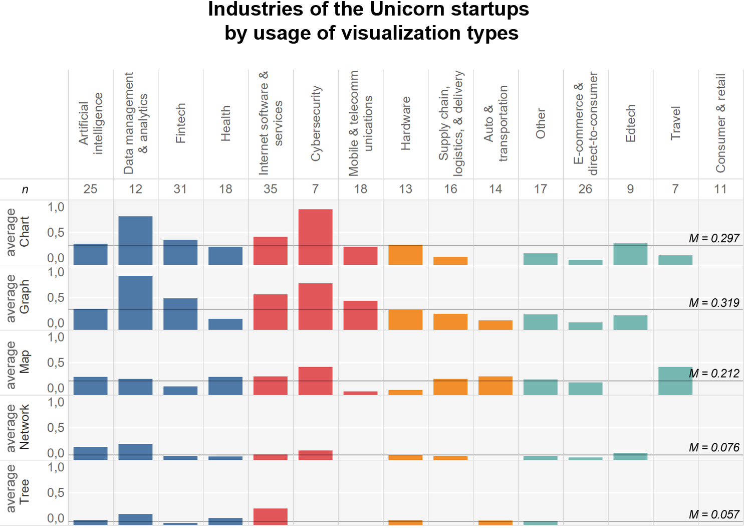
The industries also differ in the kind of data visualizations they use. Data Management & Analytics, Fintech, Internet Services and Cybersecurity use charts and graphs more frequently than other industries. The mean values shown can be interpreted as relative frequencies. For example, 75% of the companies from the “Data Management & Analytics” sector used the visualization form charts, which is significantly higher than the average of 29.7% for all companies.
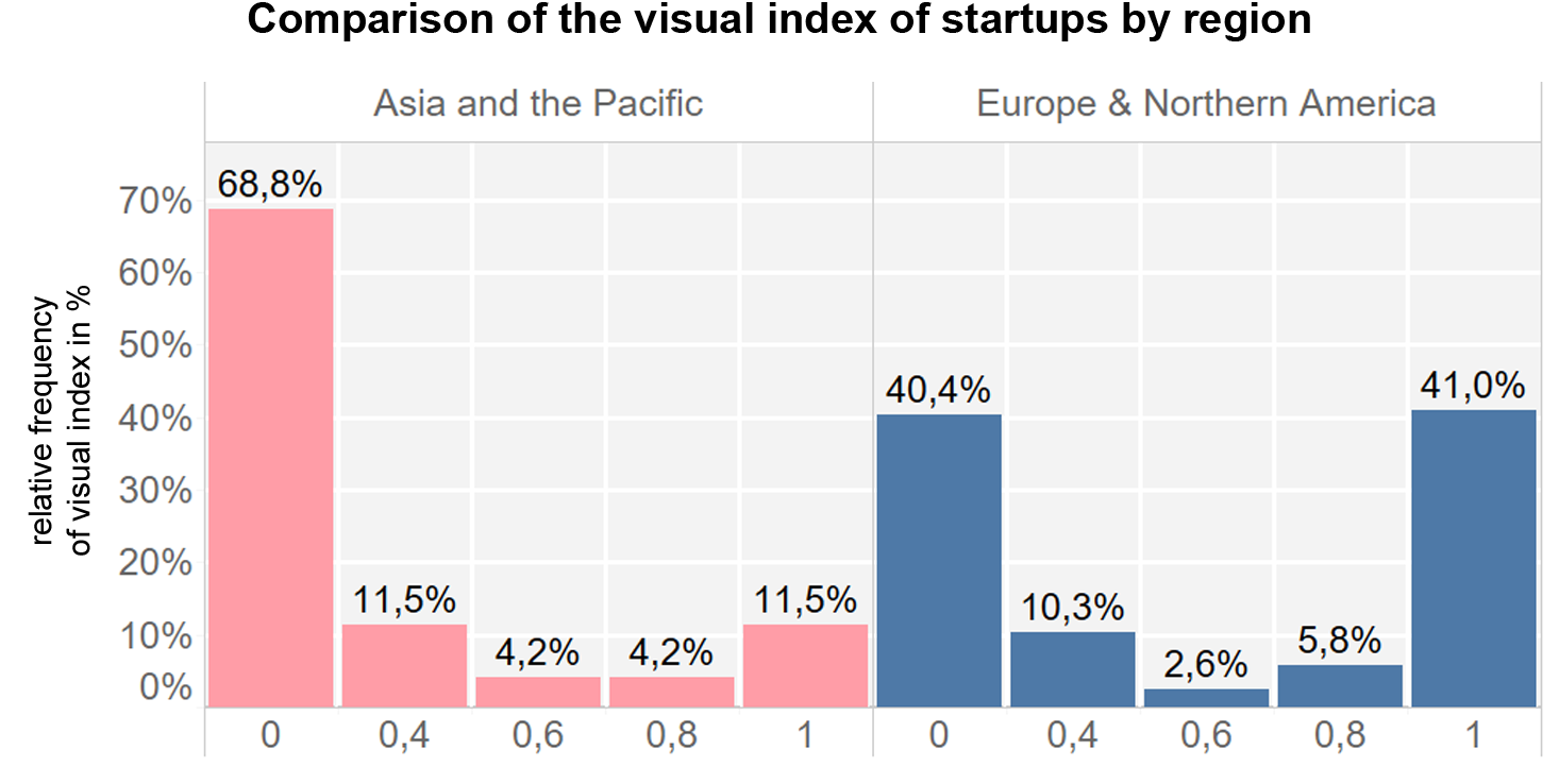
Differences also emerged in the comparison of countries. Companies from Asia and the Pacific region used significantly fewer data visualizations. The writing culture can also be an influencing factor.